The Spirit Level builds its case on the foundation of statistical analysis. In my career in engineering R&D regression analysis was a very useful tools for teasing apart the the relationships between various factors. However the features that makes it so useful in a rational investigation can be exploited by hostile critics who can easily cast doubt, eg, by invoking "unknown factors" etc.
Boundaries provide another way of interpreting the data which, although less useful as an analytical tool, should be more robust against hostile rhetoric.
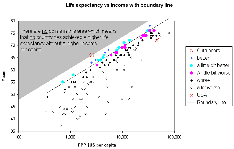
If we plot data on a scatter diagram with axis representing the two parameters which might be related, we sometimes find that there are no data points at all fall in a particular region. For example if we plot life expectancy and per capita income (shows best on log scale) for the complete set of all the countries we have data for, we see that there is a complete absence of data points in the grey triangular area at the top left:
The shows that no country has combined a higher life expectancy with a low income. Further we see that there is a bunching of points along the edge of this area suggesting a barrier that prevents countries from achieving higher life expectancy without sufficient income.
The distribution of points by distance from this line is a good fit to a Type I Extreme Distribution Function, also known as the Gumbel function. Wiki & ref2 This is the appropiate statistical tool for predicting extreme events. For example running speed records or, in this case, longevity records.
Inevitably there is some fuzziness in the boundary the empty and full regions which can be attributed to the expected variability of the data. A boundary line has been drawn to define this limit as shown. However, in many cases there will be a very few points that are some distance beyond. These are labelled "Outrunners" (they seem to be outrunning the rest of the pack). They need to be identified and examined for significance. In this case they are:
In some cases there is a sound reason why a particular country is a outrunners, e.g. it may be a small tax-haven or the data is wildly inaccurate, e.g. from a developing countries without proper collection of economic data. However a country may be doing better because of unique policies or circumstances, in which case the proper response is to ask: what they are doing right? and: can it be copied?
In this case the outrunners are not that far from the boundary line, about 4 years, which could still be down to variability in the data.
The implication that might be drawn from regression lines is that greater equality will cause an improvement, while a boundary only implies a barrier to improvement.
Life expectancy does not seem to be affected by inequality, a conclusion which will disappoint some. Perhaps we should not be surprised; to be 70 today means not dying in any of the last 70 years and for many of the countries that score well inequality has fluctuated considerably in this period.
A very significant example of such a boundary is seen in the plot of inequality against income per capita.
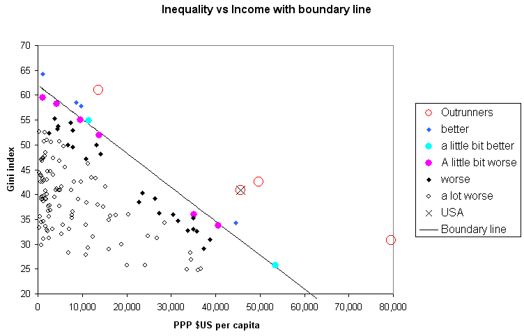
Note that the boundary line is a just a line drawn for illustration. It can be defined by an empirical equation but this does not necessarily give it more authority. In the figure the line is drawn so that nearly all the data points are on one side, on the other side there will be some that are over the boundary by an insignificant amount these are shown in the examples as pale blue dots. Points which are still close to the boundary but are beginning to be significant are shown as dark blue diamonds. The purple dots are in the same range inside the boundary as the pale blue dots are outside and the black diamonds are in the same range inside as the dark blue diamonds are outside. The positions of these points relative to the line can be safely attributed to scatter in the data.
The small black circles are points that are well inside the boundary and are not relevant to the conclusion. The boundary identifies a limit, in this example, how rich any country has become and how this depends on inequality. Only the best performing countries are near this limit. There are endless ways of not performing well.
Sometimes there are a very few points that the data points are well away from the boundary. These are categorised as "outrunners" and are earmarked for discussion.
The conclusion so far is:
No country has become more well off without also being more equal
Except for the outrunners which are:
But see new page: Corruption plus Inequality
If we plot a scatter diagram of corruption vs income we get a similar looking plot to the above with a boundary and a small number of outrunners.
If we then add the effects of inequality and corruption we get a convincing boundary with no outrunners. The outrunners from the income vs inequality diagram above have low rates of corruption.
There is very little correlation between corruption and inequality so they are working additively. It is not the case that one is the real villain and the other can be ignored; it seem more like that they are two aspects of the same thing, maybe inequality can be described as legal corruption.
The conclusion is in total contradiction to the wishful thinking of the market fundamentalists, that inequality is somehow "good for you".
I hope to post the relevant graphs here soon and see how what contribution corruption might make on the other analysis.
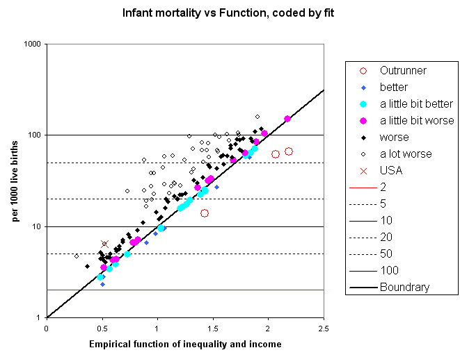
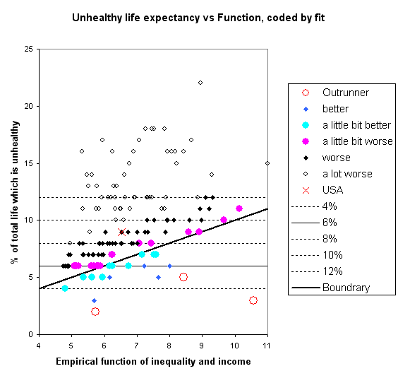
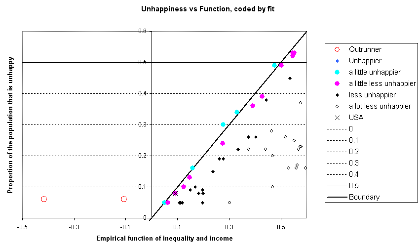
In the following examples I have created empirical functions with both income and inequality as parameters that gives a value of the factor under study that is only reached by the best performing countries.
The results are presented in two scatter graphs. The first shows how far every country deviates from the empirical prediction so the fit can be judged. A good fit should have relatively few dark blue diamonds and lots of points, the black diamonds, bunched up close to the line.
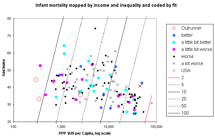
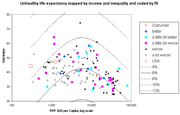
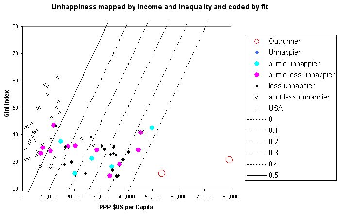
The second scatter graph shows all the countries plotted against income and inequality with the points coded with the same colours and shapes as in the first figure. The contour lines correspond to the y-axis gridlines in the first figure. A good fit should show the balance between points unbiased going from top to bottom or left to right.
 :
:
The conclusions are:
The Outrunners are:
I suggest that it is more likely that data for these countries is unsound than that it is a challenge to the conclusion
This data is published on-line by the UN
The conclusions are:
The outrunners are:
Again, I suggest that it is more likely that data for these countries is unsound than that it is a challenge to the conclusion.
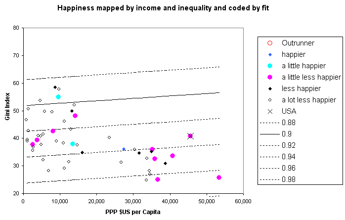
The World Values Survey publishes tables of data that includes lists of the proportion of people who are very happy, a little bit happy, a little bit unhappy and very unhappy. The following analysis uses the proportion of people that are either very happy or moderately happy.
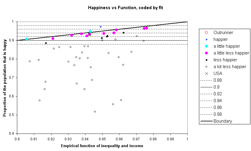
Data is from the "Fifth wave"
Conclusion:
The blue diamond corresponds to New Zealand. Arguably it does not standout enough to be identified as an outrunner.
If happiness data is plotted against income the above boundary is at the top of the scatter of points. We can see that there is much larger blank area at the bottom right, ie there are no countries with higher incomes and a high proportion of people unhappy.
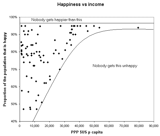
This analysis defines the unhappiness as the proportion of people who were either a little bit or very unhappy. Plotting the data against income on a log scale allows the boundary becomes a straight line.
The boundary may be clear but what it means is less clear. It indicates conditions for not getting something we don't want, a double negative, rather than achieving something we do want.
Conclusion:
The unhappiest states are less unhappy if they are richer or more equal
The outrunners are:
Clearly the trend breaks down for the very richest states, otherwise they would have less than zero people who are unhappy.